Terminology
Don't be confused by the terminology used in our industry. On this page you will find commonly and uncommonly used terminology in alphabetical order, along with definitions, diagrams and illustrations in an attempt to shed additional light on the meanings of various phrases.
Choosing a Good Font for Small Imprints:
Make sure all the lower case alphabet letters are as similar in size from top to bottom. In other words, the longest letters (b, d, f, g, j, k, l, p, q, t, y and z) should be short. An example of such font is the "President" font located in our Font Gallery.
- Make sure the letters are fairly simple in style, with open loops (the openings inside individual letters such as the opening in the letters “a” and “e”).
- Also make sure the letters are as thin as can be (this promotes clarity).
- Fonts with letters that are even in line-thickness, such as the letters of the Arial font, are recommended. In other words, look closely to see if the line thickness of each letter does not change from thin to thick and back to thin again.
For example the Times New Roman font features such letters and, therefore, modifying it and similar fonts is time consuming.
The Difference Between Center-line, Outline & Filled Images
Image - Center-lines: Center-lines of any given images are imaginary lines that run through the centers of the entire filled image (like a skeleton).
When and why do we use this term: When hard materials such as steel need to be marked, a sharp-faced stamp is needed. Therefore, any filled images, or images that has any degree of boldness, would need to be recreated with only its center lines. See Fig.1.
Image - Outlines: Outlines of any given images are all the lines that surround the entire filled image. In other words, the outlines are all the borderlines inside and around the outer edges. For example, the inner and the outer circles make up the outlines of a doughnut.
When and why do we use this term: See: “Image - Center-lines” above and Fig.1
Image - Filled: We use this phrase to describe images for logos and designs that are filled in or “colored in”. For example, a child’s coloring book featuring the outlines of images to be filled with color. After they are colored, these images would be considered “filled images”. The same applies to images we receive for producing stamps.
When do we use this term: This kind of images is primarily used to produce flat-faced stamps for marking materials such as soft metals, clay and tooling leather and Fig.1
Fig.1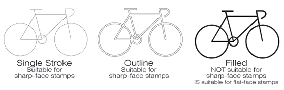
The Difference between Center-line, Outline & Filled Characters
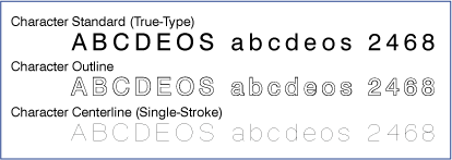
Character - Center-line: The Center-lines of a character are the imaginary lines that run though its center. In other words the character center-lines make up its skeleton.
When and why do we use this term? See: “Image - Center-lines” above and Fig.2.
Character - Filled (Standard): Existing Typeface fonts or computer font characters that were created with some degree of thickness. We call such characters “filled characters”.
When do we use this term? When a fairly soft material needs to be stamped, flat-faced stamps can be made using filled characters. However, when a fairly hard material needs to be manually stamped, sharp-faced stamps would be needed eliminating the option of using filled characters. See “Image - Filled” above and Fig.2.
Character - Outlines: These are the inner and outer boundary lines of a filled character. For example, the inner and the outer circles make up the outlines of the letter "O".
Single - Stroke Fonts: These are fonts created in single vectors (see also “Character - Center-line” above).
Why and when do we use this term? When sharp-faced stamps must be used (see “Sharp-Faced Stamp” above), you can choose from our single-stroke fonts which were specifically created for producing sharp-faced stamps that will easily penetrate hard, impressible materials. See Fig.2
Why and when do we use this term? See: “Image - Center-lines” above and Fig.2.
Fig.2
Embossing vs. Debossing

Debossed Mark: A debossed imprint is a recessed imprint (An engraved mark for example).
When do we use this term: We use it when a mark is imprinted into the surface of an item. The majority of stamps are made to achieve a debossed (recessed) effect in the surface of the material being stamped. See Fig.3
Embossed Mark: An embossed mark is a mark protruding from the surface of sheet metal. A good example is the license plate of a vehicle. This kind of mark is achieved by using an embossing die set comprised of two parts (male & female). This stamping option requires the use of a press (usually industrial).
When do we use this term: Although this phrase also means to stamp, imprint, decorate, etc., at Infinity Stamps we use this term when producing embossing die sets. See Fig.3
Fig.3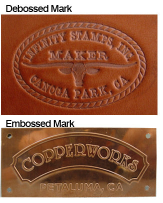
Flat Face, Sharp Face & Round Face Stamps
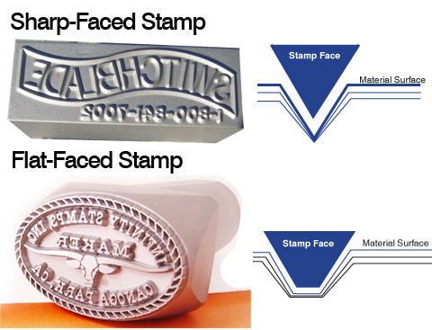
Flat-Faced Stamp: This term describes a stamp that features a character, logo or design that is made with a flat top surface.
When do we use this term: When you need to mark materials such as soft metals, tooling leather, thick card-stock, ceramic pottery clay, PMC (precious metal clay), wet cement/concrete, sand, wax, soap and any soft materials; a flat-faced stamp would be the preferred option. See Fig.4
Round-Faced Stamp: This term describes a stamp that features characters, logo or design that is made with rounded peaks.
When and why do we use this term: When low stress marking is required (to reduce impact), for example for canisters containing gas under pressure, for aerospace parts and the oil industry), round-faced or dot-style stamps are required.
Sharp-Faced Stamp: This term describes a stamp that features a character, logo or design that is made with chisel-like sharp peaks.
When and why do we use this phrase: When you need to mark materials such as unhardened carbon steel, stainless steel, wood and certain plastics that can withstand impact, sharp-faced stamps are the best and, sometimes, the only way to go. See Fig.4
Fig.4
Understanding Raster & Vector Images

Raster Image: Graphic files consisting of or containing a digital image which is a 2-D array of pixels (picture elements). In other words, a raster image is a digital image that was captured as a photograph or a scan or was created by using a raster graphics software program such as Photoshop.
A raster image can vary in its resolution but even a high resolution raster image can easily be identified by simply zooming in on it. When zooming in on a raster graphic the pixels making it up will be revealed. Examples of raster image file types are: BMP, TIFF, GIF, and JPG files.
When do we use the term: This term identifies the kind of image format (such as those listed above) that cannot be used by computer engraving programs unless converted into vector format. (See Graphics Assistance) See Fig.5
Vector Image: Graphics comprised of points, lines and curves result in a vector image. A true vector image can be increased in size with no loss of details and clarity. Furthermore, when zooming in on a vector image it will never appear pixelated.
Why do we use this term: This term identifies the only art format compatible with (or adaptable to) computerized engraving. Every metal stamp we produce involves computerized engraving and, therefore, a "clean" vector art file is the only art file that can be used. See Fig.5
NOTE: Saving a raster image as a vector file will not covert the raster image into a vector image. If you’re not sure your image(s) is in raster or vector format, any of our representatives will be glad to determine your image format. Regardless, we accept various formats and our in-house Graphics Team is available to assist.
Fig.5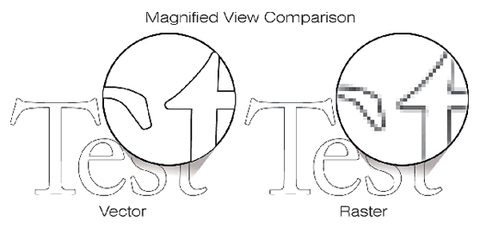
Tips for Submitting Images
- Raster files such as .JPG, .TIF, .GIF, .BMP & .PSD should be of the highest quality and the highest resolution possible.
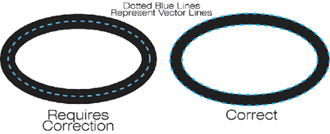
- Vector files should be free of any raster images. A useful way of spotting raster art is to zoom in closely and see if it becomes pixelated. (See example below)
- Saving a file as a vector format such as EPS, AI or FH11, does not guarantee that the image will be in true vector format. If the art file contains raster images, they need to be converted to vector format. An easy way to determine this is to preview the document in "outline" or "key-line" mode. In this mode, every outline will be a pathway for the engraving program.
- If you need help we are here to assist.
When Vector Images Need Correction
- When a filled image is provided, the entire image should be outlined and the interior of the image should be free of intersecting lines. (See illustration below).
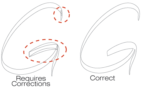
- When flat-face stamps are desired, the images should be prepared with outlines. (See illustration below).
- When sharp-face stamps are desired, the images should be prepared either as an outline, or as a single-stroke center-line. (See illustrations above).
Stamp Relief
Stamp Relief: We use this term to indicate how much the featured image will protrude above the surface of the stamp face.
Why do we use this term: The nature of the material you intend to stamp will dictate the relief for your stamp(s). In other words, for soft materials such as wood, leather and clay, the relief will be greater than the relief of stamps made for stamping harder materials such as soft metals, steel, wood and various plastics. See Fig.6
Fig.6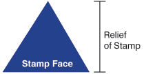
Surface Area
Surface Area {on Stamp Face}: We use this term when referring to the total length and thickness of a character, text or design. In other words, the total amount of black (filled) areas comprising the character(s), logo or a design to be used for producing any single stamp equals the total line length which makes up the surface area of the stamp face.
Why do we use this term: The amount of black present on the proof prepared for any stamp equals the portion of the stamp that will come in contact with the surface of the product you intend to mark. Therefore, when choosing a font and preparing the images for any stamp, the total “line-length” needs to be taken into consideration, as it has a direct affect on the degree of force that will be needed for achieving quality imprints. The higher the details and line length, the greater the resistance and therefore, more force is needed for the stamp to penetrate into the item being stamped. See Fig.7
Fig.7
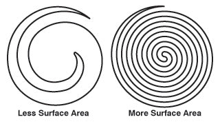
*Less force needed *More force needed
for obtaining an imprint. for obtaining an imprint.